Partition + Filler / Map Generation in runner
In this post, I’ll break down my map generation journey and how the v1.0 map generator works. Along the way I’ll discuss a key idea that came out of my first attempt at map generation: that players should be able to infer to some degree the structure of the world they haven’t seen based on what they have seen so far. This is not necessarily a general rule, but it’s one that makes sense for the way runner works and it may make sense for you in your own projects.
I had zero pre-game jam thinking done about map generation. I was, frankly, scared of the topic. I knew that if I was making a game about movement that the space would be really important. All I really had was a few principles that were a direct consequence of the movement and vision gameplay that I had already built.
Initial Principles
- Single tile width hallways are probably bad.
- Don’t make it feel like a cave or a dungeon; it needs a lot of straight walls.
- Mix “open” and “closed” spaces.
Inset BSP
I started with the excellent Cogmind “Procedural Map Generation” blog series. To avoid myself getting stuck on “good” I picked the first item off the list – binary space partitioning. Let’s do that!
The typical BSP implementation creates rooms within each partition and then tunnels them together. I knew I didn’t want cave vibes, and that felt very much like a traditional “dungeon” system. So I started with BSP, and then “inset” the partitions and knocked doors randomly in the walls. This is the sort of thing it made.

I knew the “within” spaces needed “content” of some sort, so my first approximation was those little “piles” of 0 and o characters, randomly placed. So I built a simple “template” system. I made a collection of patterns for entrances, exits, and general debris and instructed the map generator to just stuff some amount of that into the spaces anywhere it fit.

Here’s the sort of maps this would generate.

Setting aside that it very often generated maps that were impossible it just had no character. All rooms felt similar (because they were generated by the same logic), but there was also a lot of variance. You had no idea if you went east what you might find based on what you could see in your current vision. This is, I realized, a crucial feature of a map generation system. It should be true for runner that players can infer the structure of the world they haven’t seen based on what they have seen so far. And a system that will place anything anywhere denies players that ability. Of course, you can violate that expectation occasionally to great effect. But at a basic level, this approach failed because it didn’t have structured variance of the sort that enabled a player to reason about what they couldn’t yet see.
Partitions
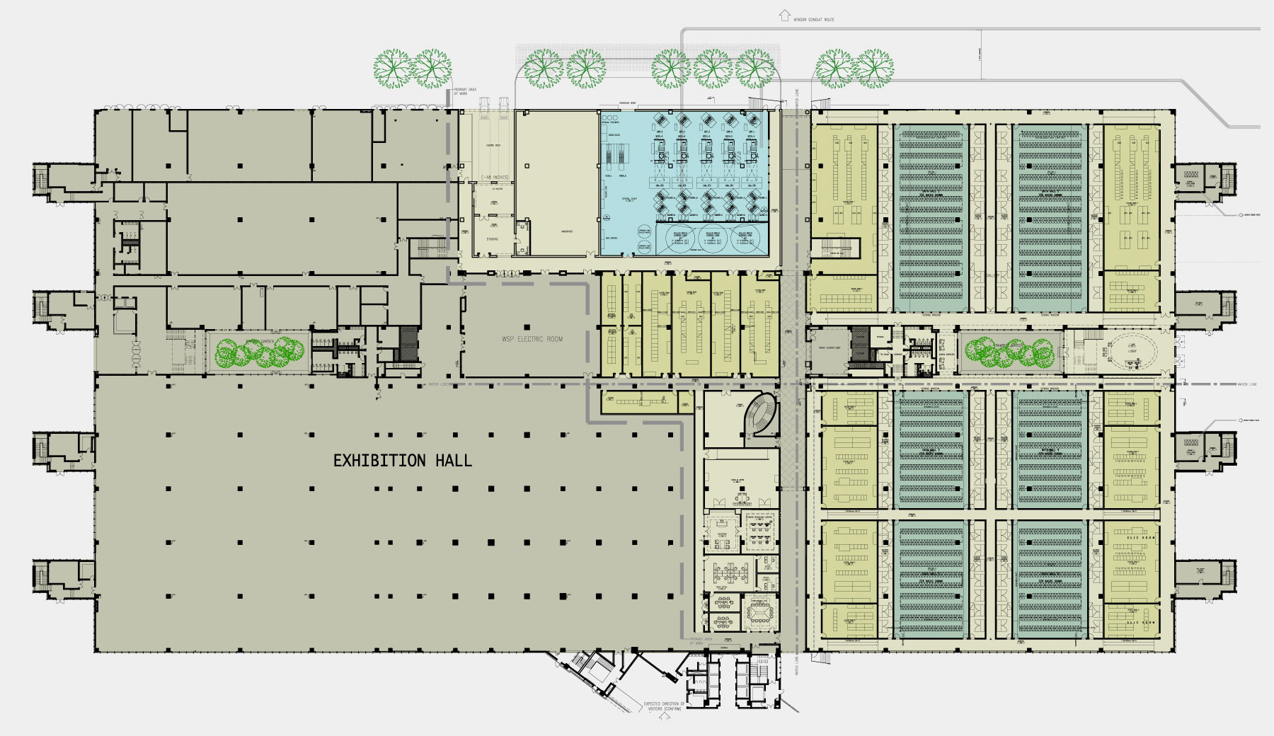
Back to the drawing board. This time, I started from theme. What do spaces that humans design tend to look like? Because my theming was “sub-basement of a megacorp tower” maybe I could find some ideas by looking at real life floor plans. Specifically floorplans from warehouse or office spaces.
Here’s a great example that helped me a lot. (source)

What I took from this (any many other similar images) was a few key themes:
- Don’t fear repetition. Most human-designed spaces have a lot of patterns to them.
- There’s some meta structure; spaces for similar use are often near each other. Offices next to offices, server racks next to server racks.
- Rectangular packing is efficient and extremely common. It’s okay to have right angles everywhere.
- Hallways aren’t a requirement; simply having open space that opens onto smaller spaces is a kind of hallway. Space doesn’t have to be for one or the other purpose.
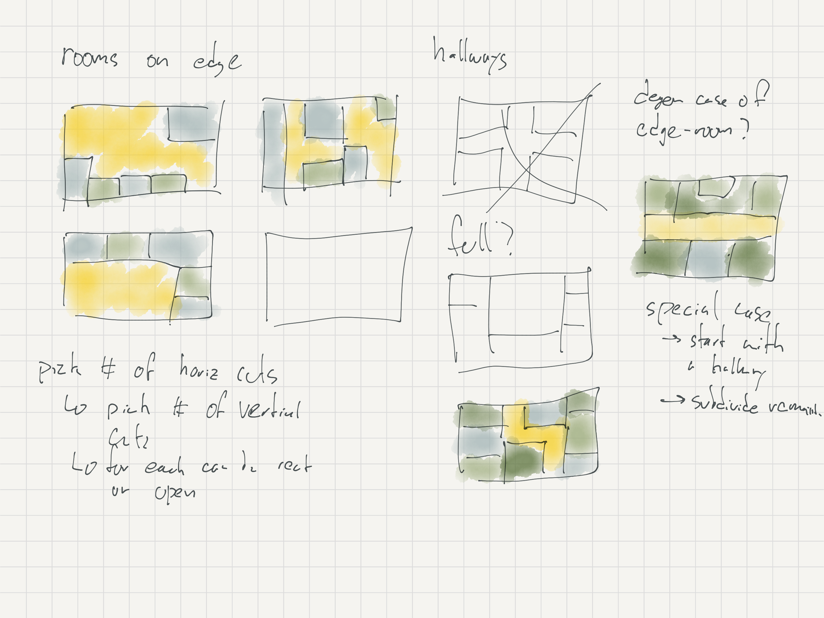
I started sketching some partition patterns that might be a fit.

I wanted a mix of open areas and enclosed areas. I wanted some common patterns; like rooms that share one dimension in common but not the other. I really liked that “phase change” in the inspiration image above, and wanted to create that feeling sometimes as you crossed over from a larger scale space to a smaller.
All this turned into a partitioning system.

Let me walk through roughly what’s going on in the algorithm.
- Pick a number of X-axis partitions to make between 1 and 4, weighted towards 3.
- For each of these partitions, pick a number of Y-axis partitions to make, between 0 and 2 inclusive.
- Draw walls along all these partition boundaries.
- Sometimes, delete a partition wall randomly.
That’s it! Deleting the walls was a real insight, and it offers some flavor and surprise to spaces. This breaks some of the overwhelming “square-ness” of the spaces this tends to create. I found this to be a productive bit of spice.
Room Fillers
An empty room is no fun. What do we put in them? Based on my insight from the first generation attempt, I wanted rooms to be internally consistent. So for each room the partition system generates, I decided to design a series of “fillers” for that room that would create consistency within that room. I drew up some sketches of potential room themes that I thought could be parameterized.


That led me to make the three fillers in v1.0:
- Rows
- Brackets
- Random
Rows is pretty simple, and any runner player has seen this many times – rows and rows and rows! This is what a map using only the row filler looks like. You might notice that this violates my original “no 1 tile width hallways” principle. This became less important because I understood the problem differently. What I didn’t want was players having to route WAY around a level to bypass a “blocked” corridor. This is not an issue with rows because rows are by definition not the only path to somewhere; at minimum there is an adjacent parallel row you could use to get to the same destination. So the principle was more precisely: do not create one-tile-wide critical paths.

The logic here is pretty basic:
- Pick horizontal or vertical rows.
- Decide whether to “cut” the rows or not with occasional blank spaces.
- If the number of rows leaves an “odd” space, fill it in with periodic walls.
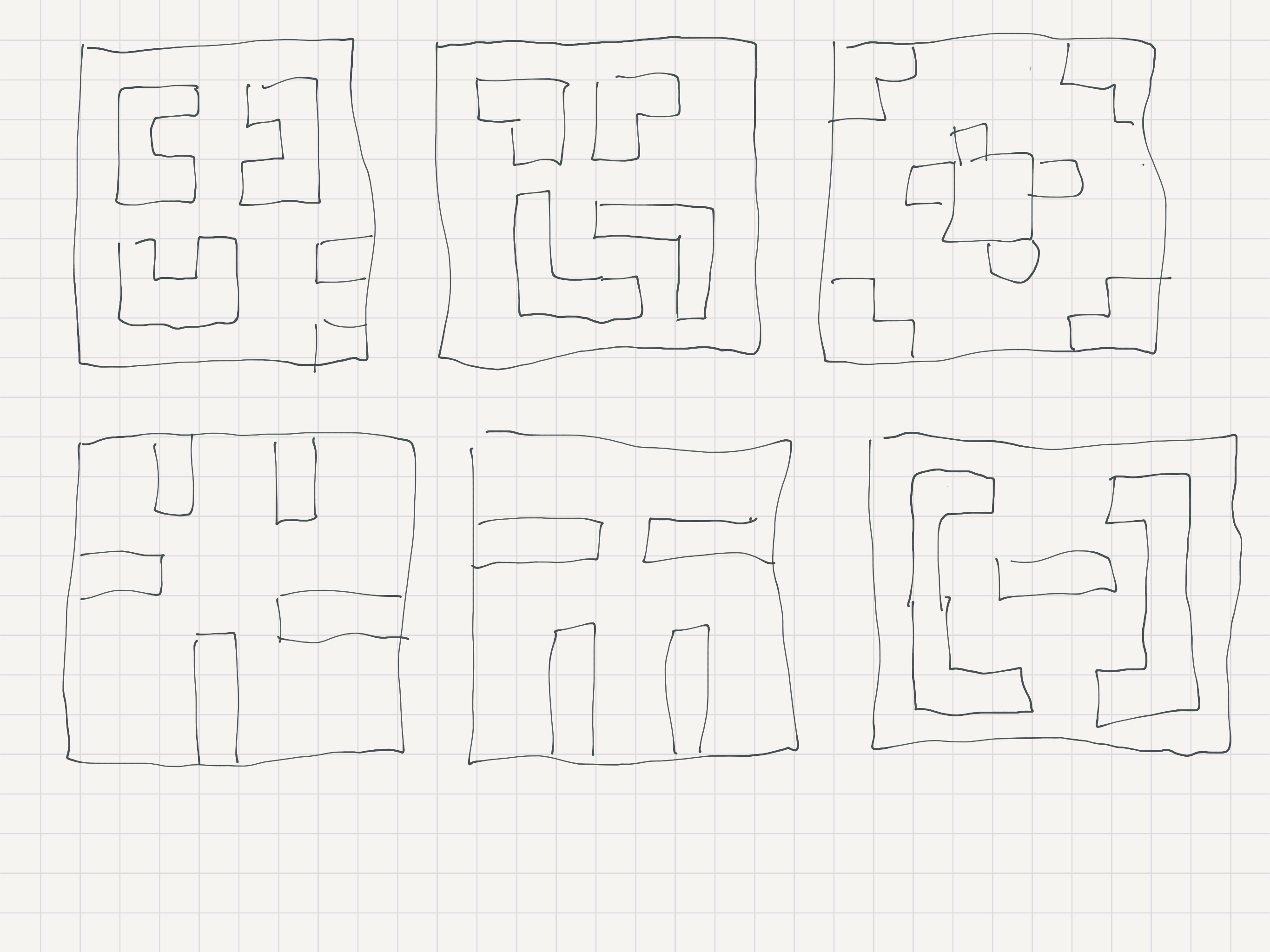
Brackets is simply voodoo. It’s designed for larger rooms. In theory it does a sequence of “inset” operations on the room bounding box, and then cuts holes in the bounding box. What it actually does is a surprising mistake that I like but do not care to understand. If you want to try, the code is here. The most strange thing about it is how much variation in result you get based on the bounding box. My hand-drawn versions and my imagination was far more regular than what gets generated here.
And then Random is a very simple Simplex noise filler copied out of a ROT.JS tutorial. I wanted spaces that felt more random. The picture in my head was of an abandoned storeroom with junk filed up in organic shapes. It doesn’t quite deliver on that, but it does create rooms that “feel” totally different than the big bracket rooms with straight walls and right angles, and I think that’s really useful contrast with the other rooms.

Finishing Touches
At this stage, I was in compromise mode. Entrances I just pinned to the left edge, and exits pinned to the right edge. They look for a spot that is passable and when they find one, done! Enemies are placed totally at random, just not immediately next to the entrance. Buttons, random! There’s a theme here. This is an area of potential great improvement, because this randomness creates high difficulty variance for players. There are levels with all buttons a stones-throw from the entrance with no enemies nearby. And sometimes they’re at the corners of the map, with a cluster of bots watching them closely. But it works well enough.
I amped up the variability in how partition walls get broken. I knew all partition wall segments needed a way through. So every segment is either: deleted, has doors added, or has a “break” in the wall added.
And finally, I added a validator. Although my invalid map generation rate at this point was pretty low, it did happen. The “random” room type was the biggest culprit – it would fill in all the space behind a door or create a button inside a wall every so often. Rather than solve that issue, I wrote a validator that checked that there was a path from the entrance to each button and to the exit. If there wasn’t, try again. It would have been viable to simply ensure that the fillers and the wall-cutters guaranteed solutions at generation time. But validation felt safer; I didn’t need to be “perfect” and see every potential outcome.
Inferring Broader Structures
So, back to our original idea about what makes for a good map generator.
Players should be able to infer to some degree the structure of the world they haven’t seen based on what they have seen so far.
How does that work here?
- Players learn the rough “filler” styles quickly. If you are in an area with rows, you can guess those will continue for some distance. But there is uncertainty – does it continue to the boundary of the map? Will there be gaps?
- Astute players will notice that partition walls use a different symbol in the game – “#” versus “/” for filler walls – and can expect that that will be have a door or gap in it, eventually. (Even if you don’t catch on to the symbol variation, there’s a kind of semantic pattern to the “vertical” walls you encounter that I suspect people can sense.)
- The bracket generator has a lot of symmetry. There’s some weirdness to it, but in a fundamental way it’s going to repeat its corners four times. So if you find one corner, you can expect there will be three others. It may or may not have more “layers” to it, but corners beget corners.
- Players may intuit that there are room size limits to the fillers. The bracket filler is only applied to rooms larger than 9x9. So if you see a row layout or a random layout, you are also learning something about the rooms dimensions; one or both are smaller than 9.
I doubt that even players who “win” could vocalize any of these principles. But to my mind, there’s a lot of value in creating these “kinks” in the randomness. It adds texture that people can build a broader mental model off. Even better, these patterns have some relationship with how the spaces we live and work in are structured, so it’s not some totally novel structure to the world on some alien planet.
And that’s that! If you want to poke at the full code, it’s here. It’s by no means pretty, but I’m proud of the results it makes. You can also load up the game itself and press “M” on the title screen. That puts you in map generator mode and you can click through generated maps.
runner
/ a cyberpunk escape roguelike /
| Status | Released |
| Author | Drew Harry |
| Genre | Strategy, Simulation |
| Tags | 2D, Seven Day Roguelike Challenge, Cyberpunk, Retro, Robots, Roguelike, Singleplayer |
| Languages | English |
| Accessibility | Subtitles, Interactive tutorial |
More posts
- Lessons learned from watching playtestsMar 20, 2024
Comments
Log in with itch.io to leave a comment.
Fantastic write-up. I was wondering about the map-gen - it was sufficiently challenging to explore and navigate without generating completely frustrating dead ends (such as ending up in one "prong" of the map only to find that the exit is on the other prong). Very interesting
Question: I can't speak to this with certainty, but I could have sworn that twice so far I've had maps (both cases it was the first level - chronologically, I mean, not LVL-1) where one of the data nodes was in an enclosed space only reachable via Burrow. One was a particularly memorable occasion because I tunneled into the room with the node and a patrol in it, had the Hunter follow me in, and then circled back around to the entrance I had made to get back out. I don't think I could have possibly missed an existing door if there had been one. Do you know anything about that?
It shoulddddd be the case that the validity checker will reject the map in the case you describe. I have seen cases where players think it’s inaccessible but it’s not.
Or the validity checker could be broken! It was a hard bit of code to test in a hurry. I didn’t have time to build up nice test sets that I had pre validated. So it’s quite possible there are errors that my manual testing missed.
Thanks for reading!
I found a VERY hard to hit button in my developer commentary here: https://youtu.be/mXRjvb0w1Yc?si=22sTrqlZxpV38Oxv&t=1202
It was ultimately accessible, but it looked like it might be impossible early in the run. Maybe this is something like what you encountered?
I don't think so, most likely it was a room accessible only via diagonal corner tiles that I missed.
Which, I'm torn about. My biggest issue with them is that it's often very hard to see if there's a corner entrance or not until you're looking at it squarely. So scouting them is a bit of a timesink.
Yeah I think that’s just bad map generation on my part. I switched the map validity checker to only use 4-way movement which I think will cause it to reject maps that REQUIRE diagonal movement to get to an objective. However I haven’t yet found a map that actually DOES require that, so I’m not certain it’s working yet. :D